Playing to a full house
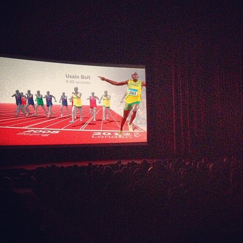
Our BBC Explainer film about the Titanic was featured in ARC in Portland, Oregon, US - “ a theatrical program dedicated to the art, creativity and complexity of animated infographics.”
We were in good company, shown with films from the NYT and GOOD Magazine.
Reading between the lines, there seemed to be a lot of different types of graphics there – from the engaging end informative to the more expressive end of the spectrum.
A review is here by Drew DeVigal.
We are currently working on a larger sequence of these films, to be revealed nearer the summer.
Journalism.co.uk Interview
![]()
Max Gadney was recently interviewed about User Experience in news.
The principles haven’t changed too much but new tech (tablets etc) and formats (social media) always distract people from what they should really be focussing on.
Economist Intelligence Unit interview

Max Gadney was recently interviewed for a report on Big Data by the EIU.
The report looks at many of the big questions around our industry – but our contribution focused on the need to understand the context of use and the needs of the users.
Most big data conferences focus on the technology involved in gathering, storing or analysing data. There is less discussed about how we can present it well – beyond cute infographics.
We’ll reveal the beginnings of a major project soon that illustrates these ideas.
Speaking at O’Reilly Strata London in October
Max Gadney is speaking at
The subject of the talk is ‘Data Experience Design’ – what happens when you modify traditional design methods to deal with data as the principle material. The talk will look inside the After the Flood Playbook, to reveal methods used at recent work for client such as BBC and the UK Government.
The Strata London conference is part of the O’Reilly tech conference network and this one focusses on the business, design and tech of ‘Big Data’.
Sports Graphics Article in Domus

I have contributed an article on sports visualisation to Domus magazine.
Their ‘Supernormal’ department edited by Dan Hill looks outside or architecture to related industries to see what they can learn.
The article especially looks at how football is a qualitative sport currently measured quantitatively – a fact that is appropriate to most Big Data initiatives at the moment. You only have to read the soccer/stats bloggers to see that despite their love of the game, football doesn’t make the right kind of stats to analyse itself – the opposite to baseball. This is true of nearly anything that people want to measure nowadays.
Anyway, we are currently working in this area and will have some work to show after the summer.
Enjoy the Article.
PSFK interview – Infographics vs Visualisation

We recently did an interview with PSFK.
One of the questions asked was about the differences between visualisation and infographics.
Any emerging industry struggles to define what it does – and often the clients don’t really mind. But I think designers should reflect on the differences as many of them are using data visualisation techniques and motifs (interactivity and depth) to make things for an infographic audience (people who want simplicity).
That’s the main thing – read the rest of the interview.
Eye Magazine Article – “You Are Here”

I have just written an article for Eye magazine - the world’s leading graphic design quarterly.
The article is on information design and its value to industry. It looks at how information design is about an experience beyond graphics or data displays and how designers need to understand the whole product and not just the visualisation element.
Elsewhere in the magazine, I have written a tribute to Peter Sullivan, the original visual journalist. Also in that section (on information design from the past) is an amazing and awful reproduction of the Brooks Slave Ship diagram.

This is a valuable reminder of the political power of showing with information. In this instance, it is even more dreadful as the data points are people – whose painstaking rendering adds an expressive quality missing from much of what we see today.
Strata Conference, Santa Clara, 2012
Max Gadney will be speaking at the CA at the end of Feb.
He will be talking about video projects with the BBCand what understanding video can tell us about making better data interfaces.
Come and say hi.