Chesscasting
We recently finished work on a live event application for the World Chess Championships. Our role was consulting on the digital product design. We advised on how to shape the combination of user experience and information design. How would time as well as space be used? What information would expert chess fans want to see?
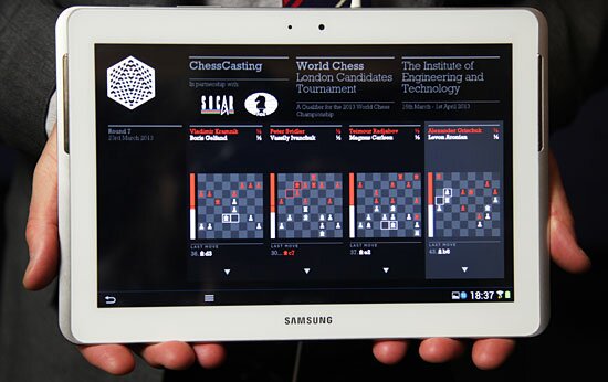
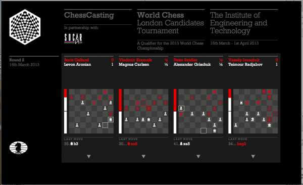
, this app seeks to engage spectators at tournaments. Each spectator receives a tablet, preloaded with the Chesscasting app. This gives them an overview and an in-depth view of the live games. In addition to this, there is commentary, discussion features and the ability to see all live games as well as background information on players.
User spectrum
This was the first version of the product, with the team seeking feedback on key features. There are many other ideas that could be investigated, but for the v1 build, we were keen that the app not be overloaded. One key consideration was balancing the needs of a simple overview with the complexity demanded from chess fans. As well as experts, there would be guests and sponsors in the audience who would need some orientation in the game.
New syntax
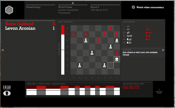
This is why we introduced the ‘advantage bar’ down the side to give an indication of who was winning. This is an example of introducing new ‘syntax’ into any system – it was a new way of talking about success – and it is something we see in many other projects too. In fact competitive or sports apps are ripe for exploitation in new syntax. The main thing we did was to understand the needs of the audiences – and a key question for the more novice audience was ‘who is winning?’. The advantage bar goes some way to addressing that. We will see how to grow on those ideas in next versions.
Our Partners
During development, we all vastly improved our chess knowledge (neither of us will be challenging Magnus Carlsen too soon!) but it was great to have the help of World Chess chief-of-staff Robert Fontaine. Robert is a chess Grand Master and his domain expertise allowed us to navigate some of the more complex indicators of advantage as well as scenarios for game outcomes.
We worked with the team at World Chess, who put on the competition, Pentagram who did the graphic identity and Thoughtworks who did the engineering.
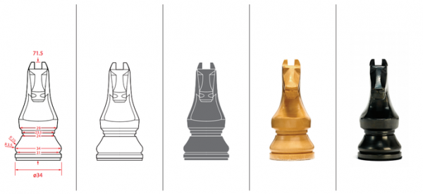
In addition to the app, Daniel Weil at Pentagram created new pieces and the event design too.
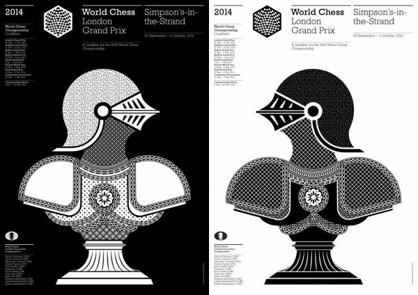
Pentagram’s identity and posters were very strong as was the logo, created by John Rutherford.
Next steps
This project is symbolic of our ability to understand and transform complex ideas into usable and engaging products. The ‘discovery’ phase uncovers the needs of users as well as information about the domain and overall needs of the business/ client. We are looking forward to the next versions, where the product will get better and better as it seeks to address the needs of 500 million chess fans world-wide.

