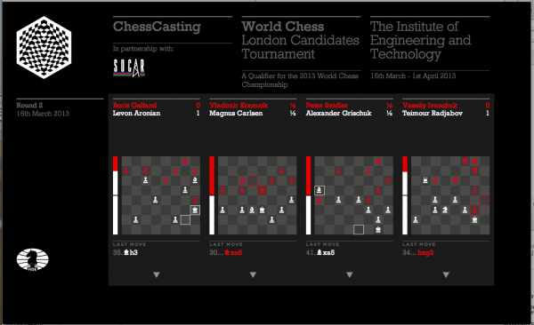
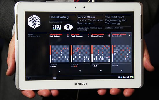
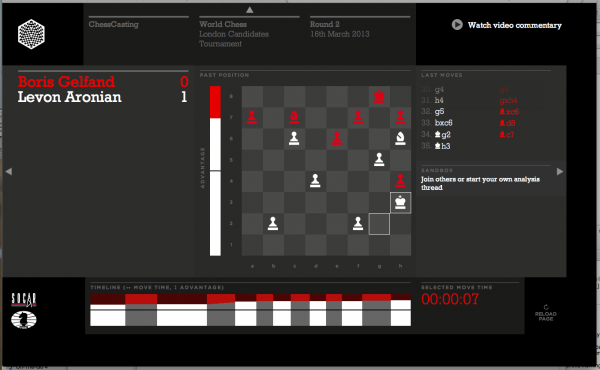
Chesscasting
We recently finished work on a live event application for the World Chess Championships. Our role was consulting on the digital product design. We advised on how to shape the combination of user experience and information design. How would time as well as space be used? What information would expert chess fans want to see?
, this app seeks to engage spectators at tournaments. Each spectator receives a tablet, preloaded with the Chesscasting app. This gives them an overview and an in-depth view of the live games. In addition to this, there is commentary, discussion features and the ability to see all live games as well as background information on players.
User spectrum
This was the first version of the product, with the team seeking feedback on key features. There are many other ideas that could be investigated, but for the v1 build, we were keen that the app not be overloaded. One key consideration was balancing the needs of a simple overview with the complexity demanded from chess fans. As well as experts, there would be guests and sponsors in the audience who would need some orientation in the game.
New syntax
This is why we introduced the ‘advantage bar’ down the side to give an indication of who was winning. This is an example of introducing new ‘syntax’ into any system – it was a new way of talking about success – and it is something we see in many other projects too. In fact competitive or sports apps are ripe for exploitation in new syntax. The main thing we did was to understand the needs of the audiences – and a key question for the more novice audience was ‘who is winning?’. The advantage bar goes some way to addressing that. We will see how to grow on those ideas in next versions.
Our Partners
During development, we all vastly improved our chess knowledge (neither of us will be challenging Magnus Carlsen too soon!) but it was great to have the help of World Chess chief-of-staff Robert Fontaine. Robert is a chess Grand Master and his domain expertise allowed us to navigate some of the more complex indicators of advantage as well as scenarios for game outcomes.
We worked with the team at World Chess, who put on the competition, Pentagram who did the graphic identity and Thoughtworks who did the engineering.
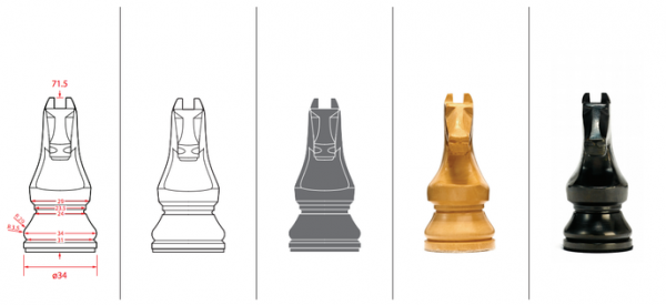
In addition to the app, Daniel Weil at Pentagram created new pieces and the event design too.
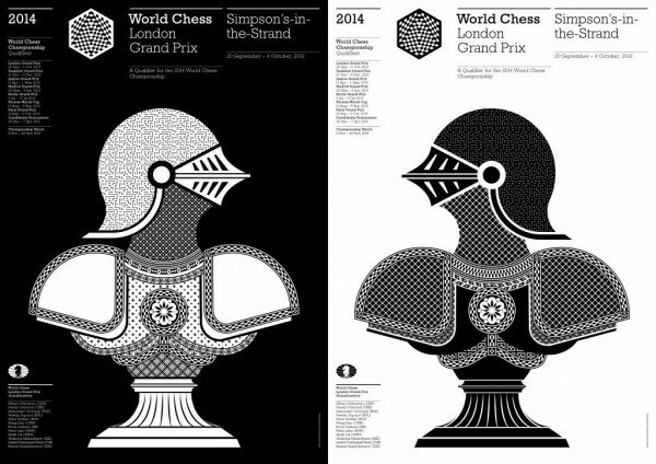
Pentagram’s identity and posters were very strong as was the logo, created by John Rutherford.

Next steps
This project is symbolic of our ability to understand and transform complex ideas into usable and engaging products. The ‘discovery’ phase uncovers the needs of users as well as information about the domain and overall needs of the business/ client. We are looking forward to the next versions, where the product will get better and better as it seeks to address the needs of 500 million chess fans world-wide.
BBC Explainers Production Guide

We have recently completed a video and production guide for the BBC Explainers video format.
This video illustrates key points from a larger how-to guide we made for the BBC around the subject of the Explainers video format.

BBC Explainers exist to inform the general public of big subjects in an accessible and engaging manner. They should instill confidence and encourage further discovery.
The How-To video above puts a lot of emphasis on narrative structure and scripting as much as visual direction. When it comes to visuals, we encourage a more immersive and filmic approach than some flash-based 2d visualisations out there.
iPad app for the Prime Minister

Part of our recent work with the UK Government GDS department saw us helping out Alice Newton with the Prime Minister’s briefing app. There have been a few news articles and posts about this and without giving away any confidential detail, here are some thoughts on this fascinating and high-profile project and how the issues are similar throughout the world of decision making.
Summary
The design of software for leaders and executives is very different from that for analysts and middle managers.
1- Business Intelligence tools for executives are filtering devices. The single key design factor is ‘show what is important right now”.
These people have full diaries and very little time. Whilst the PM app contains a lot of content and a traditional structure to access the depth, it contains a simple alert system – a method of highlighting updates and new things to see.
2. These tools need to augment the Human Intelligence that already exists.
The PM is surrounded by advisors and smart people. Any tools need to help their messages get through – or at least store these insights for later use. In our research for the app, we took some time to understand how the PM’s particular advice cycle (as different to a Fortune 100 CEO) may work so that the architecture of this app echoes his human networks.
3. BI apps need to show answers to specific questions.
The content sections in the PM app are based around his strategic priorities. Without giving anything away, they are a little more personalized than cross-departmental updates. There is obviously a lot of information in each of these key areas, so the alert function had to lead to a brief status report and then offer more depth. This was similar to the schema of the GDS Dashboard, with the design optimised for starting simply and getting more depth on demand.
4. Analytics culture is still young and faces hostility.
Nobody is suggesting that the PM only makes decisions based on one piece of software, yet a skeptical press had a bit of fun questioning the usefulness of such tools. In business, sports, health and every corner of our world, analytics software that can help us make decisions is becoming more prevalent. This gradual shift is opposed by those who see it as a zero-sum activity. They fear software will drive them out of a job or it replaces wise and experienced people. This is not the case – these tools can only work alongside smart analysts and people who use them.
5. Custom building is necessary for security issues but is now cheap and feasible to do quickly.
The last ten years have seen an explosion in software tools that can build quicker. Ten years ago, you would need to hire a giant like IBM or Serco to come in and work on your project. These days , a small, motivated team can have a version 1.0 product working within months due to new software languages and the libraries of product features that now exist.
If you have an executive board who are swamped in data, get in touch.
Government Digital Service – Dashboard tool
We have recently helped the GDS (part of UK Government Cabinet Office) plan and prototype a dashboarding system for their departmental data. Working with Matt Biddulph, we spent a month at their offices pathfinding with live data and researching the needs and social flows of the users.
There is a full write up on the GDS blog of our recent work with them and I have added a few more reflections and some more examples below too.

The Brief
We were asked to create a tool for many levels of the department so people could get the data they needed to make their decisions. This demo and version one specification would then be used to show other government departments the potential of data display tools.

What we did
The first half of the project was a demo with prototyped screens and working code to show what was possible to the department. It involved a lot of Playbook methods – especially in the understanding of the audiences and context of use of the product.

The second half was working with the engineering team to iterate the demo into a Version 1.0 launch. For this we provided design guidelines and pixel measurements, font specifications etc.

We tried to demo with as much real(istic) data as possible but that wasn’t always possible so some of the grabs from early demos need forgiving.

Partnerships
It was great to work with Matt Biddulph - one of the most talented and genial technologists in the world. Matt very quickly got a sense of the grain of the data and started to both discover news ways to show data and also ways of making new data – eg a script that automatically creates an alert when a certain amount past the standard deviation is reached. His and my tempo of investigation and design synched well and within two weeks we had a great demo.

We were sited in the GDS office for the project which allowed people to drop by and see what we were doing. This allowed us to both understand a lot of the business of GDS as well as sell in to stakeholders of all levels.

Our client, Richard Sargeant, is passionate about data informed decisions so we always had a steer from him on what was useful to his department. His analysts were really open in describing their work and also helpful in testing the integrity of what we were proposing.
Next steps
We are still engaged with the GDS department as the product develops and I’ll also be We also want to do more work for government, health and security clients so do get in touch.
UEFA.com – Pitch View application
The Brief
UEFA.com asked us to develop new features to engage football fans with the upcoming re-launch of their Statistics area. We pitched a dozen different options, and narrowed the field down to one, Pitch View, for launch in the Champions League 2012-13 season.

UEFA wanted to prioritise attacking play and show the ‘ebb and flow’ of games along with key events. They also wanted visualisations that would live in the match reports, not just in a centralised area.

Our Pitch View app innovates in several areas:
The ‘Attacking Algorithm’ – sense-making in midfield data
The editorial leadership at UEFA wanted Pitch View to overcome the visual noise that hampers many football visualisations.

Most football stats highlight ‘possession’ which is often shown by *All Possession* on the pitch. This leads to visualisations that are too cluttered either from showing every passing line or heat-maps that show the whole pitch covered. We wanted to editorially and visually edit and articulate key moments and locations in the game.
We developed an algorithm that sifts the possession and location data to find the meaningful events. The weighting we developed is based on:
- Proximity to attacking third of pitch
- Moves that end in attack
- A ranking of attacking moves and their locations
This algorithm is typical of how you can build on the data you are provided with to create unique value for a new product.
The timeline only shows events that are significant moments in the game – and these are shown on the ‘Events’ view, with more traditional goalmouth views for goals.

Action Areas – beyond the heat-map
Powered by the algorithm, the Action Areas map shows where effective attacking play took place – rather than where all play took place. We visualized these areas as hexagons, which are more readable than jarring squares and floating circles. The default view is for the whole team, but the player vs player comparisons really show the accuracy. Roll-overs tell you who did what when in which area.

‘Attacking Momentum’ timeline
We have built on the previous UEFA timeline, now showing which team is having more attacking impact. The timeline serves to show key moments but also overall ebb and flow of the game. Sports fans all want to know ‘who is winning?’ and this timeline shows the spikes of impact, where one team has had more attacking play than the other.

Team Shape – Parametrics
Team shape shows us how teams play in formation. We have kept this one simple to avoid the complexities of the more baroque network visualisations out there but will certainly be looking to so more in this area. (an article here talks about this more)
We also edited down the number of key passes per team in the interests of visual clarity, but will be looking to expand the insights into passing patterns as we iterate.

Partnerships
UEFA.com were great to work with. They have a strong sense of their editorial focus, engaged usability advocates and a mature product culture.
We worked in a three stage process. The first stage is Planning – understanding audience and business/ editorial needs, agreeing the product direction and basic design. This Planning phase is our core strength – bringing together all the forces (audience, data, business needs) to make something unique and engaging.
Second was prototyping where we did most of the work on developing the Attacking Algorithm with real code and finalising designs. Third was Production – regular calls and the iterative dance between tech, design and product management to launch the application.
As well as being our build partner, Made by Pi put considerable effort into project management, UX and collaborating on getting the data to do what we needed it to do. Paul Lemon, their CTO, worked tirelessly with us to get the algorithm for the impact timeline and action areas just right. Loz Gray was also involved – contributing his design and footballing insights to the development phase. It was a great example of how we work - bringing the right people together for each project.
Deltatre are the UEFA area providers and somehow found time to work with us despite also running data for the Euros and Olympics. They were very open to new requirements of their data and collection, where our product features required it.

What Next?
We love football and data products so are looking forward to the next foray into this area. There is plenty to be done on the beautiful game.
Encode Explorer for Nature Publishing Group
We have just completed the Encode Explorer for Nature Publishing Group, an application that shows connections between papers written using human genome data.

The Brief
The first important papers to build on the release of the human genome data are now being published. Nature Publishing Group wanted to show the thematic connections between these papers beyond the common subject and contributors.
They wanted an interface that would allow users to navigate papers by this system of editorial subject ‘threads’. Nature have a lot of experience in science visualisations for print but this was their most ambitious digital visualisation to date.

Method
Crucial to this particular application were the concerns of different stakeholders. The planning phase required editorial teams to both understand the threads concept as well as test our prototypes for scientific integrity. Alongside this, we wanted it to work across browsers and on tablets too, so the visualisation would need to be robust and usable as well as innovative.

Design
This application is mainly steered by the sensitive colour hierarchies. We were fortunate that there were enough threads to allow colour coding with enough difference between colours. The main accent colour was reserved not for a key data points as usual but for key functional elements such as buttons and call outs.
This is the crux of Data Experience Design – it is not just the visualisation we need to design but the whole context of the visualisation too, the controls, links with other sites or apps, all putting the user at the heart of the interface design process.

Partners
We worked with Nature’s editorial and design teams to develop a UI that would both expose the complexity of connections and be easy to use.
Our development partners Made By Pi were excellent, especially in refining the product for accessibility and execution across many browsers including tablets.

Future
We want to do more work in the science and medical world so get in touch here.
BBC – ‘Titanic’ videographic

Our most recent Videographic is on the Titanic - it features in the BBC History site - as an introduction to the subject for all audiences.
Client involvement
The BBC wanted the subject matter to be timely and relevant so we looked at their upcoming site launches/ news anniversaries and decided on this one.
It was important to sign of the main direction of the story early on – that we would retell the story but would avoid regular tropes such as hidden causes or blame. Their main input came in the script sign-off stage. As well as signing off the script, they saw an indication of visual style early on.
During the production period, we had about 28 renders for me to go through. I would only send the main ones to them – when we had something major to show. It was more about just showing progress than the need for sign-off though for more controversial subjects, we would probably insist on more stages of sign-off.
How we did it
There is obviously a lot of effort involved (the full method will be in the AtF Playbook) but here are a selected five things we did:

In the story, we wanted to avoid the the usual conspiring about causes – we felt that there were a bunch of bad circumstances that all piled up at the wrong time.

- We also wanted to show that people of all classes escaped and that the ‘women and children first’ order worked as well as it could.

- We wanted to avoid the usual glistening 3D models and concentrate on views that would instill meaning into their story sections. So we showed versions of the boat in plan or skeleton form – and the sinking is an amalgamation of views – that acknowledges its un-reality.

- We had to represent the ship and it’s interior – but all at the service of the main story. So instead of endless cutaways, we looked at the engines in context of Belfast, escape routes for the sinking and the cabin plans in context of passenger types and so forth.

- The mapping is inspired by Richard Edes Harrison, who’s Look at the World Atlas showed destinations from where they were being looked at – inspired by the new technology of civilian air-travel – affording people new views on how to see routes between locations.
‘The Stars’ – BBC Videographic

We have been working with BBC to develop a ‘Videographic’ content format for their Knowledge and Learning website.
We started off with this one all about the Stars. It’s a pilot so we are still learning about the format and what works best, but the opportunity to launch it during the BBC Stargazing event was too good to miss.
We were determined that there was a decent script and visuals that made the most of video z-space.
Part of getting the script right was working with the right expert input so thanks to Public Astronomer at the Royal Observatory Greenwich. And thanks to Fiona Romeo for her advice and connections.
I’ll be talking about the production of this at Strata soon. I’ll also be saying why I think that these Videographics can teach us a lot about interface design. In themselves they are also a very effective way to sell complex ideas – especially because they can hold attention for so long when done well.
I’ll also do a post on what we learned from this and how to do them well. Back to work, its a busy first quarter.
(any comments, do go to the Vimeo page)
BBC

We are working on new content formats that maximise engagement and information uptake across a broad range of audiences and subjects.
We are doing a report that outlines the thinking behind the project and how to produce the new format. More will be revealed over the coming months – and we have been asked to talk about this at a [to be announced] conference in early 2012.
Edelman Visual Information Strategy

We recently finished a visual information strategy for the worlds largest independent PR firm.
Edelman wanted to be ahead of other communications agencies in their use of visual information.
We created a training document that they could share and learn from. It was divided into several sections:
- We provided a glossary of current definitions.
- We showed how different media channels such as print or web best use visual data.
- We provided insight in current methods that are working and others to avoid as well as a guide to commissioning work.
This report gives Edelman new ways to help their clients to communicate in a data rich era.
Projects
- World Chess Championships
- BBC Explainers Production Guide
- iPad app for the Prime Minister
- Government Digital Service – Dashboard tool
- UEFA.com – Pitch View application
- Encode Explorer for Nature Publishing Group
- BBC – ‘Titanic’ videographic
- ‘The Stars’ – BBC Videographic
- BBC
- Edelman Visual Information Strategy
